The Los Angeles Kings have introduced a brand-new logo that pays homage to their illustrious past while charting a course for the future. Inspired by the team's 1990s era, characterized by the legendary Wayne Gretzky, the updated emblem seeks to bridge the gap between history and modernity.
Nostalgic Inspiration
The revised logo brings back the iconic "Chevron" design that was a hallmark of the Gretzky era. This decision serves as a nod to a time when the Kings' branding was heavily influenced by one of hockey's greatest players. Gretzky's tenure with the Kings not only elevated the team's performance but also left an indelible mark on its visual identity.
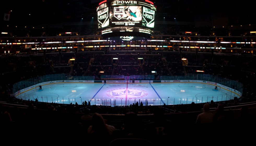
Included in the new logo is an updated version of the original 1967 crown, providing a link to the franchise's foundational years. Prominently featuring "Los Angeles" at the top, the logo encapsulates the team’s pride in representing its city while celebrating its rich history.
A Collaborative Redesign
The process of creating this revamped logo was comprehensive and collaborative. According to Luc Robitaille, there was extensive effort and teamwork involved: "This has been an extensive and collaborative process, and we are thrilled to roll this out to our fans and the city of Los Angeles." The redesign took two years and incorporated feedback from both past and current players, ensuring it resonated with the entire Kings community.
The intent behind this redesign is not solely rooted in nostalgia; it aims to set the stage for future iterations and extensions. "This evolution is rooted in our 57-year history and embraces the elements of our eras," said Robitaille. The new logo is a reimagining of elements from the early '90s jerseys, re-invigorating them for today's audience.
Honoring History and Embracing the Future
Wayne Gretzky's influence on the Kings was a significant period that the franchise continues to draw inspiration from. By reviving the "Chevron" design and updating the original crown, the Kings are making a clear statement—they respect their past while looking forward to future successes. "From ownership to our players, our organization is proud to usher in a new era of LA Kings Hockey. We are excited for our fans to be part of this with us," remarked Kelly Cheeseman.
The new logo replaces the former one unveiled in 2008 and seeks to strike a balance between honoring the past and resonating with contemporary fans. The fusion of classic and modern elements aims to create a sense of continuity and connection, strongly resonating with the team's dedicated fanbase.
Launch and Availability
The new logo will be available for purchase starting Friday, June 21. Fans can get their hands on the new merchandise at the Crypto.com Arena's Team LA Store, allowing them to be part of this new chapter in the Kings' history. The organization believes that this redesign will serve as a significant milestone, linking historic moments with future ambitions.
Quotes and Reactions
Luc Robitaille emphasized the extensive effort and collaboration involved in the creation of the logo. "This has been an extensive and collaborative process, and we are thrilled to roll this out to our fans and the city of Los Angeles," he said. Robitaille also highlighted the design's roots and its evolution. "This evolution is rooted in our 57-year history and embraces the elements of our eras." He noted that the design process involved feedback from past and current players, indicating a widespread approval and acceptance.
Kelly Cheeseman expressed the pride felt throughout the organization: "From ownership to our players, our organization is proud to usher in a new era of LA Kings Hockey. We are excited for our fans to be part of this with us."
The redesigned logo's launch marks an exciting time for the Kings, as they continue to build on their legacy while embracing future opportunities. This new emblem stands as a testament to the team's storied past, present accomplishments, and future aspirations.